
The Natural Drama Black & White Formula: From Flat Photo to Gallery Print in Lightroom
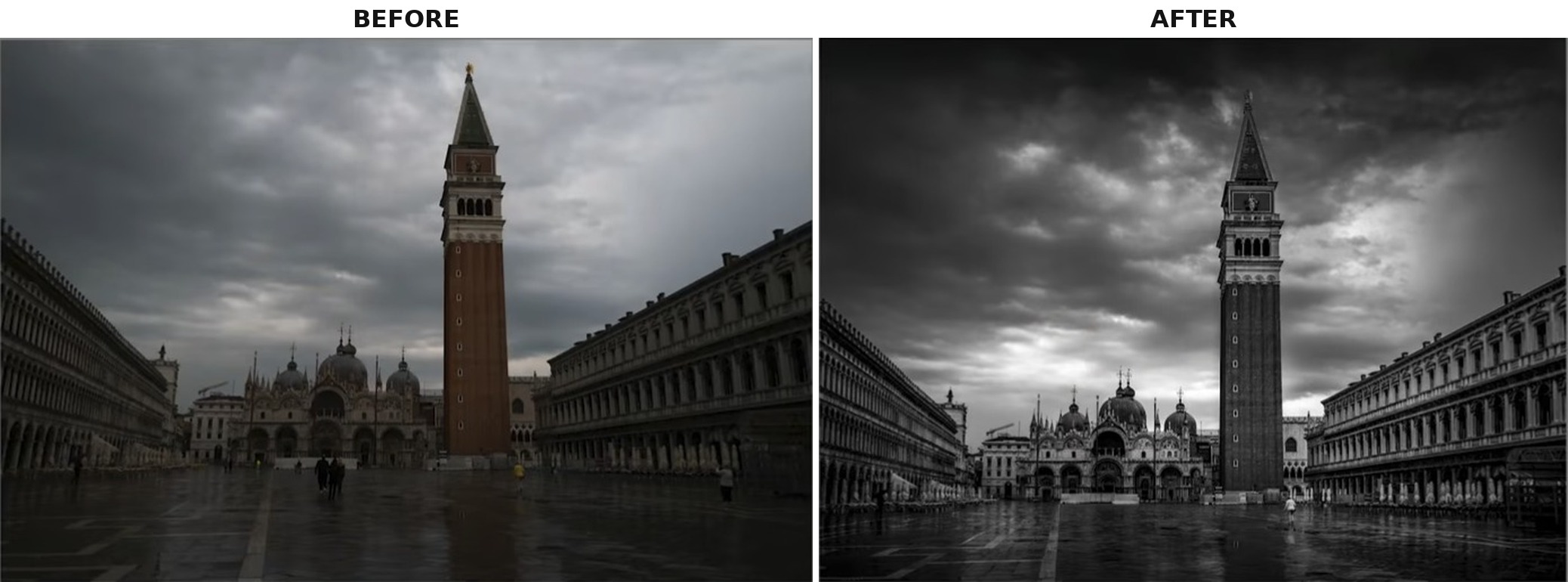
Some photos look almost apologetic straight out of the camera — flat, grey, a little shy. This piece walks through the exact Lightroom moves that take a dull shot of Venice's Piazza San Marco and turn it into a moody, gallery-ready black and white, using a repeatable six-part formula: exposure foundation, color refinement, sky dodge and burn, quick directional adjustments, soft-brush depth, and distraction removal.
Step 1: Build the Exposure Foundation
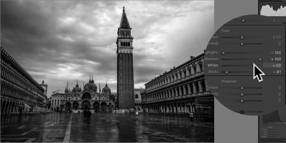
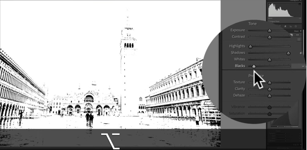
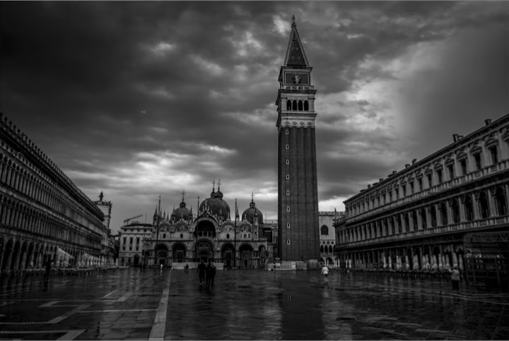
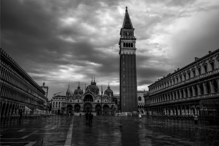
Before touching color or mood, the base tonal range has to be right. The process starts by switching the image to black and white, then working the Basic panel: opening up the Shadows, pulling down the Highlights, and — while holding Option (Mac) or Alt (Windows) — pushing the Blacks until a genuinely deep black point appears. That Option/Alt-drag trick shows exactly which pixels are clipping to pure black in real time, so the black point can be set with confidence instead of by guesswork.
Once the shadows are anchored, the Whites slider is used to bring back the overall brightness until the exposure feels right. At this stage it's normal for the sky to look brighter than ideal — that gets corrected later with targeted dodging and burning. The instinct to fix everything with global sliders is worth resisting here; this step is only about locking a strong, confident tonal base.
Why a virtual copy helps
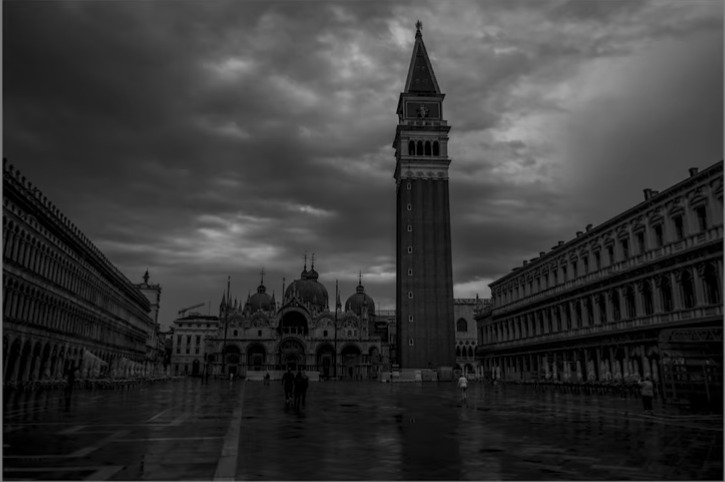
A useful habit at this stage is duplicating the image as a virtual copy before making changes. It costs nothing in storage and gives an instant way to compare the original flat file against the edited version at any point in the process.
Step 2: Refine Color Before Committing to Black and White
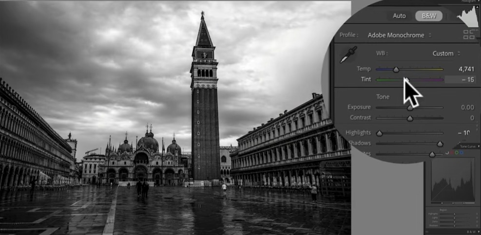
It feels counterintuitive to adjust color on a black and white photo, but two controls still shape the final tones in a meaningful way. The first is White Balance: moving the Temperature and Tint sliders changes how the underlying colors translate into shades of grey, so it's worth experimenting freely until the mood feels right, since a photo with lots of blue in it will react very differently to warmer or cooler settings than one with warmer tones.
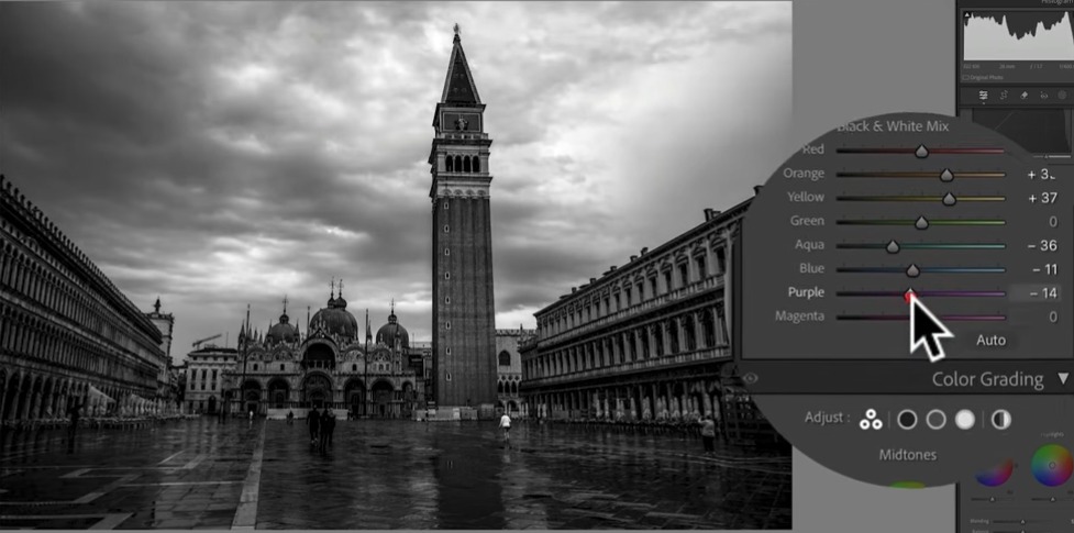
The second is the Black & White Mix panel, where each color channel — orange, yellow, aqua, blue, purple, and so on — can be pushed brighter or darker independently. The fastest way to find what matters is to nudge a slider firmly in one direction and watch the preview: if nothing visibly changes, that color barely exists in the photo, so the slider gets double-clicked back to zero and the next one gets tried. A general ceiling worth respecting is not pushing any single channel much past 40, since extreme values can introduce odd artifacts on files with less dynamic range than a high-end raw file.
Step 3: Dodge and Burn the Sky with AI Sky Selection
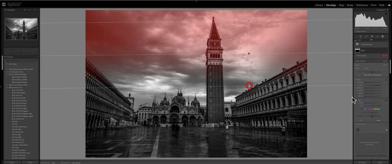
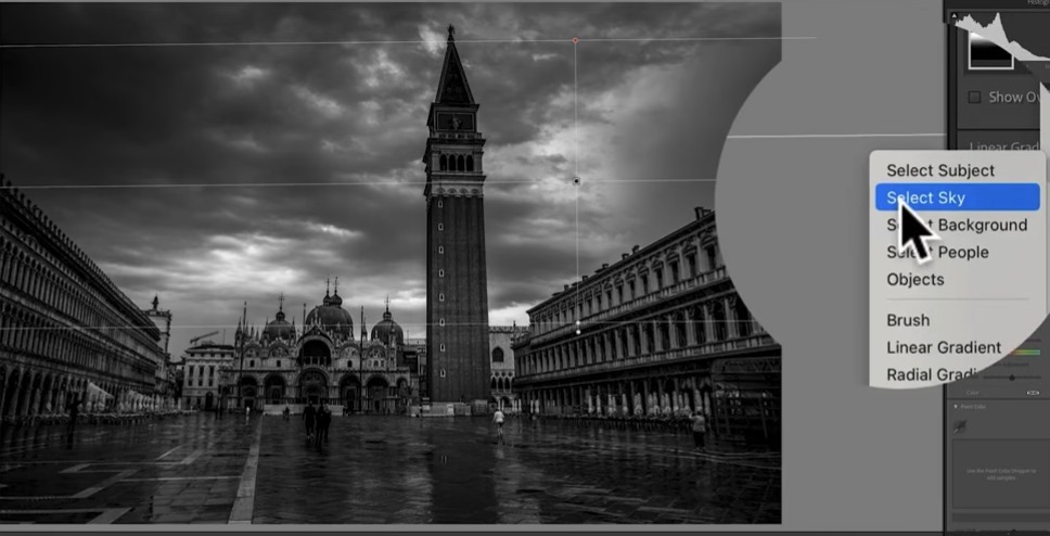
This is described as the most important step of the whole formula. The goal is a strong gradient across the sky — darker at the top, lighter near the horizon — so the eye is pulled down into the frame rather than escaping upward. The obstacle is that a simple linear gradient darkens everything it touches, including any tall structures crossing into the sky area, like a bell tower or rooftop.
The fix is a masking shortcut: after drawing the gradient, opening the three-dot menu on the mask and choosing to intersect it with an AI-detected Sky selection. Lightroom's AI then subtracts any building, tower, or foreground element from the mask automatically, so the tonal change only affects the actual sky — even where architecture overlaps the gradient area. Working in two passes (a soft overall gradient across the whole sky, then a second, stronger one just at the very top of the frame) gives more control than trying to nail the effect in a single move.
Step 4: Quick Directional Adjustments
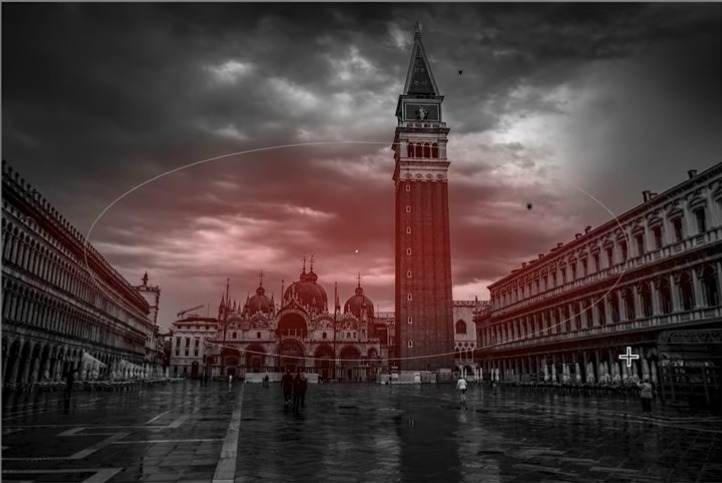
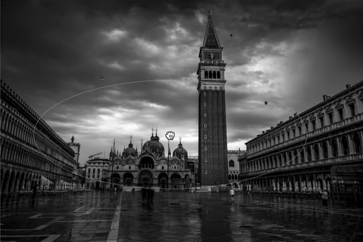
For faster, more intuitive local tweaks, a directional click-and-drag tool offers a shortcut to the same kind of effect: clicking on an element such as the bell tower and dragging upward brightens it, dragging downward darkens it. The same logic applies to the sky — click, then drag down to deepen it, or up to lift it. It's a faster alternative to building a full gradient or radial mask when only a quick, localized nudge is needed.
Step 5: Add Depth with a Soft Brush
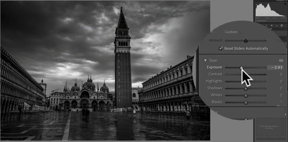
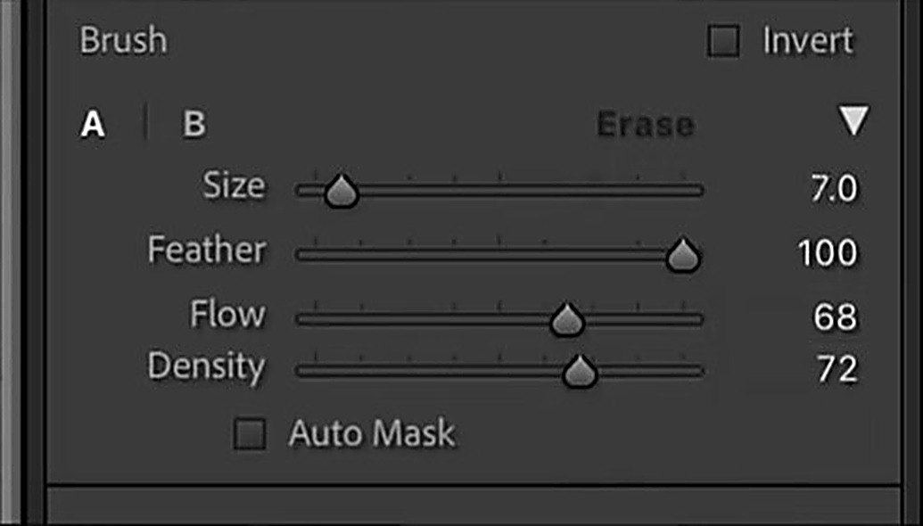
The last local-adjustment technique is what could be called "complexifying the light" — using a soft brush at very low strength to introduce subtle brightness variations rather than one flat tonal change. The settings that make this work are a Feather set all the way to 100 (for a soft, invisible edge), a moderate Flow and Density in the 70s, and a very low Exposure value, often around 0.5 to 0.9. Painted in small, deliberate areas rather than everywhere, this builds up gentle pockets of light and shadow that make the final image feel more three-dimensional and less like a single flat edit.
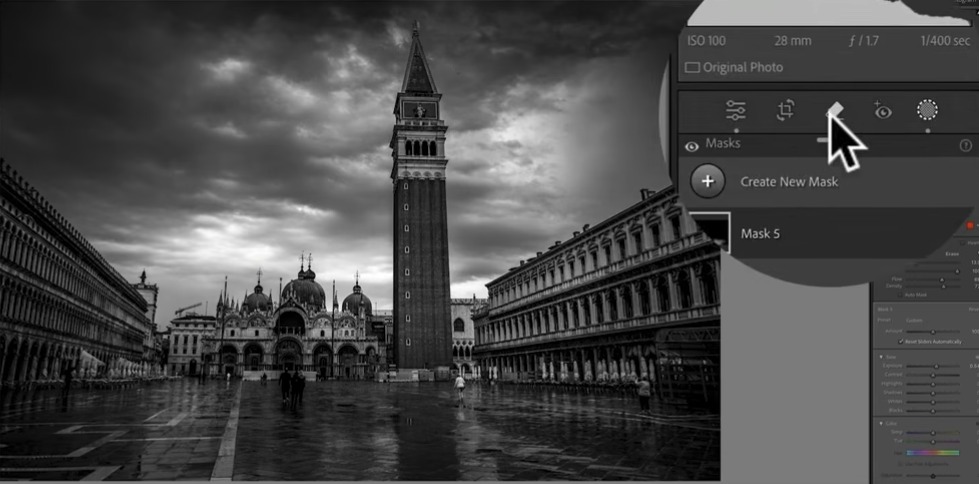
Each brush stroke is kept on its own mask layer, which makes it possible to review, adjust, or lower the strength of any single stroke afterward without disturbing the others.
Step 6: Remove Distracting People with Generative Remove
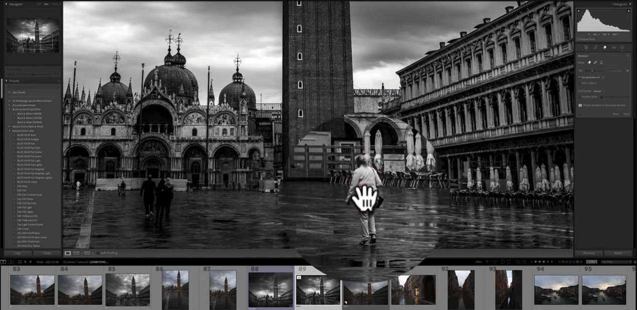
A busy square like Piazza San Marco often comes with passersby that pull attention away from the composition. With Generative Remove turned on, brushing over an unwanted person and clicking Remove lets Lightroom's AI reconstruct the background behind them. One practical lesson from this process: results are noticeably more reliable when removing people one at a time rather than selecting a group in one go — group selections are more likely to produce odd artifacts or leave a person partially intact, sometimes requiring two or three attempts on the same area before the removal looks clean.
Not every person needs to go: a single well-placed figure, especially one who contrasts with the surroundings, can actually help a composition by giving a sense of scale. The goal isn't an empty frame, but a clean one, with only the distracting elements removed.
Putting the Formula Together
None of these six moves is complicated on its own, but layered together, they form a repeatable formula: lock the exposure and black point, refine the color that will become grey, dodge and burn the sky with AI-assisted masking, use quick directional drags for fast local fixes, add depth with a soft low-opacity brush, and clean up distractions with generative removal. Applied consistently, this is what turns a flat, ordinary frame into a print with real presence.
Frequently Asked Questions
What is the Natural Drama Formula in Lightroom?
It's a repeatable six-step process: build the exposure foundation with the Basic panel, refine the color that will become grey tones, dodge and burn the sky with AI sky masking, use quick directional drags for local fixes, add depth with a soft low-opacity brush, and remove distractions with Generative Remove.
How do I darken only the sky without affecting buildings in Lightroom?
Draw a linear or radial gradient over the sky, then open the mask's three-dot menu and choose to intersect it with an AI-detected Sky selection. Lightroom automatically subtracts any building or foreground element from the mask, so the effect only touches the sky.
What brush settings give the most natural-looking dodge and burn?
A high Feather (around 100) for a soft, invisible edge, moderate Flow and Density in the 70s, and a low Exposure value, often between 0.5 and 0.9. Small, deliberate strokes built up gradually look more natural than one heavy pass.
Should I remove every person from a travel photo?
No. A single well-placed figure that contrasts with its surroundings can add a sense of scale and actually help a composition. The goal is a clean frame, not an empty one, so remove only the elements that genuinely distract.
Explore More From Photo Serge
Want to go further with your Lightroom workflow? Here are more guides:
- Lightroom Editing for Beginners: Where to Start (The Natural Drama Formula)
- The Best Masking Tool in Lightroom: A Step-by-Step AI Masking Guide
- How to Remove Anything From a Photo: Dust, People, Reflections, and Wires
Get my FREE Lightroom preset here: https://bit.ly/AIPresets
