
How to Choose Your Best Photos for a Stronger Portfolio
Years ago, a Nike art director gave me one piece of advice that completely changed how I present my photography: your portfolio should only contain your absolute strongest work. Not your favorite work, not everything you're proud of, your strongest work. Most photographers get this backwards, and it makes their portfolio look weaker, not stronger.
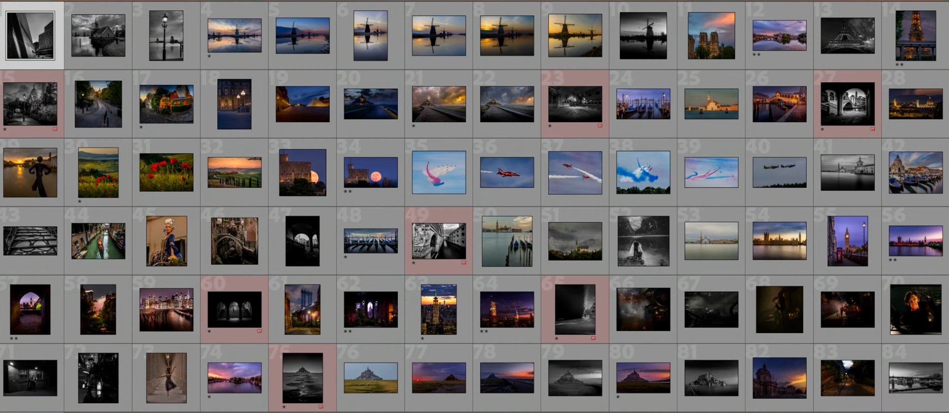
To show exactly how this works in practice, I sat down with 85 photos from one of my longtime students and narrowed them down to 23. Here's exactly how I decided what stayed and what went.
All 85 photos, laid out in Lightroom before any cutting.
Why Fewer Photos Make a Stronger Portfolio
The instinct when you love photography is to show everything you've made. But a portfolio isn't a diary, it's an argument for your skill, and every weak or merely-okay photo you include dilutes that argument. Someone looking at your work forms an impression from your weakest images just as much as your strongest ones. Cut the middle, and what's left hits harder.
The Six Things I Judge Every Photo On
Going through Richard's 85 photos, I wasn't judging on a single "is this good" gut check. Every image gets weighed against the same six things:
- Light, is the light in the frame actually doing something, or just present
- Composition, does the frame have a clear structure, or does the eye wander
- Color, is the color intentional and controlled, or just whatever the scene happened to be
- Originality, have you seen this exact shot a thousand times, or does it feel like a specific moment
- Consistency, does it fit the style of the rest of the portfolio, or does it feel like it belongs to someone else
- Branding, does this photo tell people who you are as a photographer
A photo can be technically excellent and still get cut if it fails on consistency or originality. That's the part most photographers miss: a strong photo in isolation isn't the same as a photo that strengthens the portfolio it sits in. A mood-driven, almost cinematic shot like this one, a railway worker signaling beside a steam locomotive, earns its place precisely because nothing else in the set looks like it.
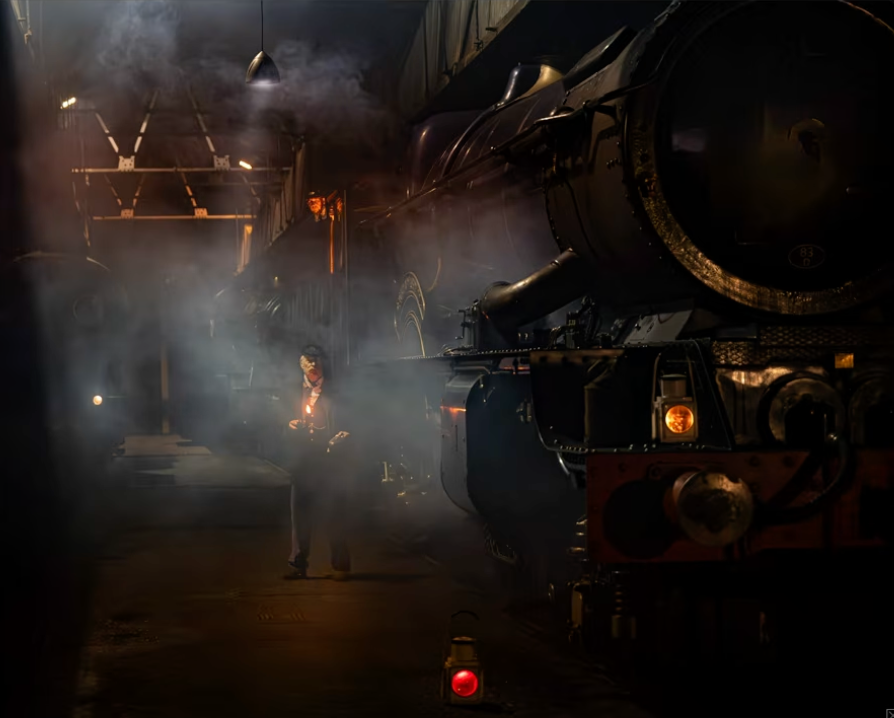
Originality in action: a mood and subject nothing else in the set repeats.
How I Use Lightroom Stars, Labels, and Survey Mode to Select Images
The actual selection process happens inside Lightroom, using three tools together rather than one long scroll through a grid:
- Star ratings for a fast first pass, separating the images worth a second look from the ones that aren't
- Color labels to tag photos by theme, mood, or category as you go, so you can see patterns across the full set instead of judging each photo in isolation
- Survey Mode for the hard decisions, putting near-duplicate or similar shots side by side so the weaker one becomes obvious instead of guessed at
Survey Mode specifically is where most of the real cutting happens. Looking at one photo at a time, almost everything looks acceptable. Looking at two similar shots next to each other, the gap becomes obvious immediately.
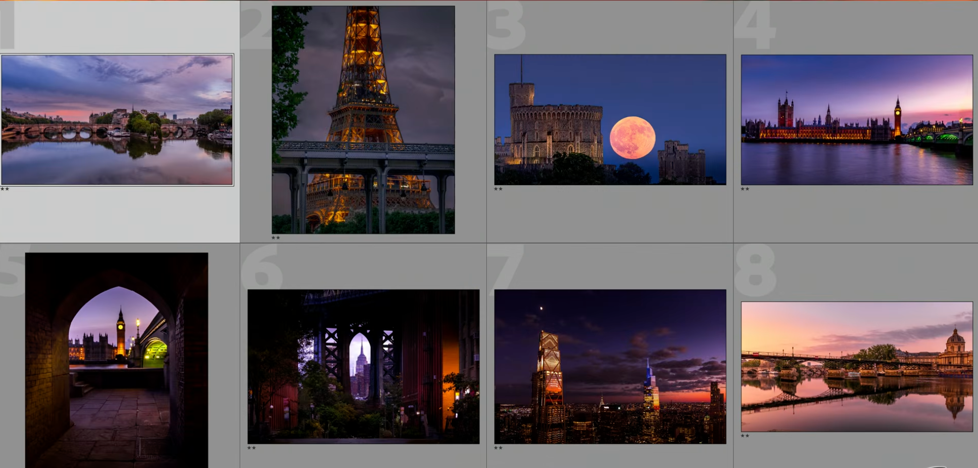
Survey Mode: eight strong contenders compared directly, side by side.
Cutting 85 Photos Down to 23: The Real Process
The first pass isn't about finding your best 23 photos, it's about removing anything that's clearly not in contention: technical issues, weak light, compositions that don't hold up. That alone usually cuts a set by a third or more before the harder decisions even start.
The second pass is where the six criteria come in, photo by photo, asking whether each one earns its place next to the others that survived. The final pass is about the set as a whole, not individual images: does this collection of 23 tell a consistent story about who you are as a photographer, or does it still feel like a random sample. A striking one-off, like this supermoon rising behind Windsor Castle, has to earn its place the same way as everything else, on its own strength, not just because it's a rare shot.
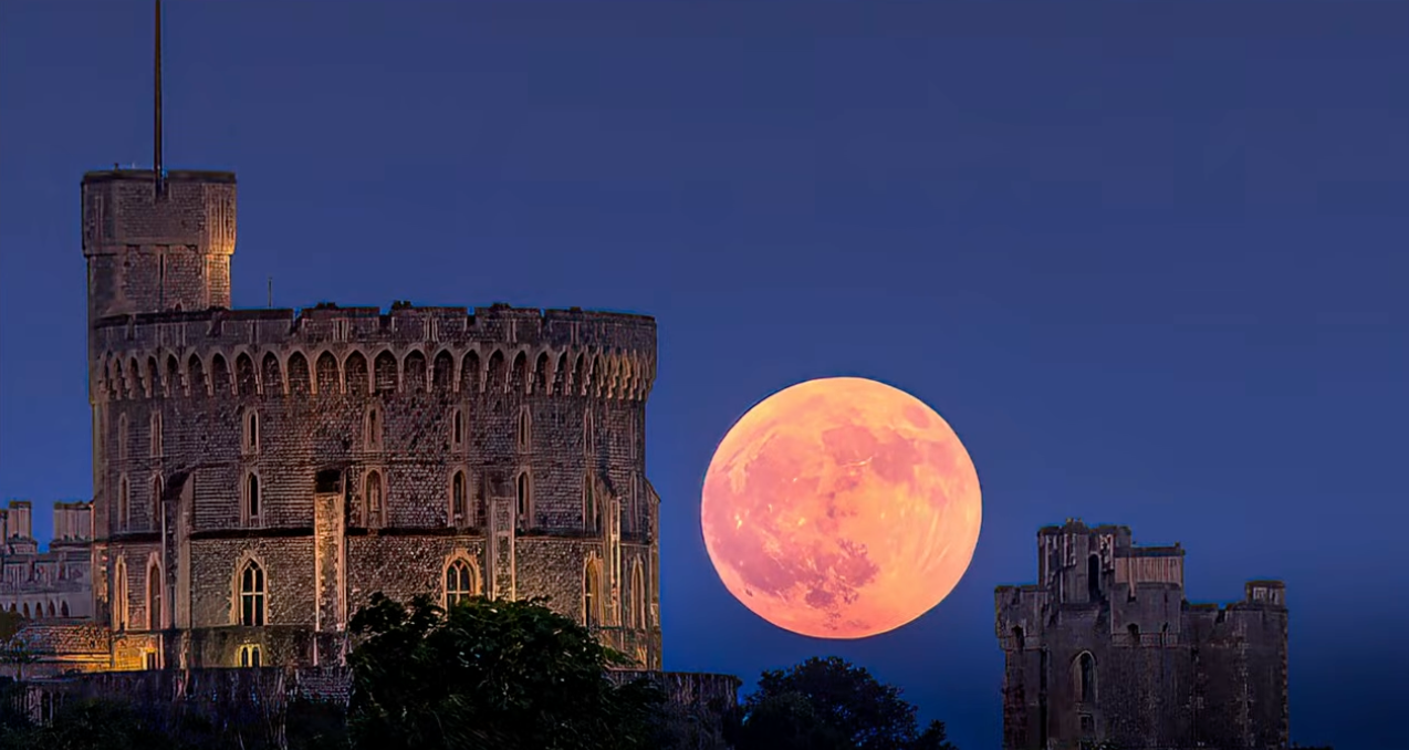
A rare shot still has to earn its place on the same six criteria as everything else.
Why Similar Photos Weaken Your Selection
One of the fastest ways to weaken a portfolio is including multiple photos of the same subject, angle, or idea, even if each one is individually good. Two similar shots don't reinforce each other, they compete, and the viewer starts comparing them instead of appreciating either one. Almost every time I use Survey Mode on a pair of similar images, only one of them makes the final cut.
Should You Separate Color and Black and White Photography?
Mixing color and black and white images in the same portfolio, or the same sequence, can break the visual consistency you're trying to build. It's worth deciding deliberately whether your black and white work belongs in its own section, its own gallery, or interspersed, rather than letting it happen by accident because that's the order you shot the photos in.
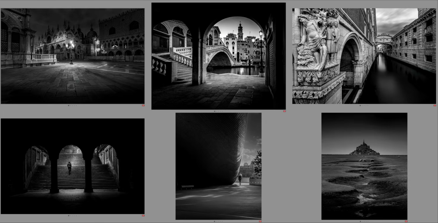
Richard's black and white work, grouped together rather than scattered through the color photos.
Building a Consistent Style and Brand
Consistency isn't about every photo looking identical, it's about someone being able to look at your portfolio and recognize a point of view. That comes from repeated choices: how you treat light, how you use color, what kind of moments you're drawn to. A portfolio of 23 consistent images says more about you as a photographer than 85 images that each go in a different direction.
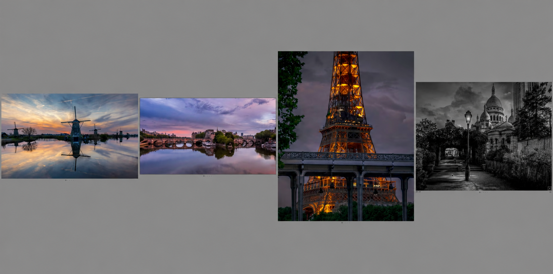
Four finalists from very different scenes, still reading as one photographer's work.
The One Rule: Every Image Should Feel Strong
By the end of the process, the test for every remaining photo is simple: if someone only saw this one image, would it make them want to see more of your work? If the honest answer is no, it doesn't belong in the final set, no matter how much you like it personally.
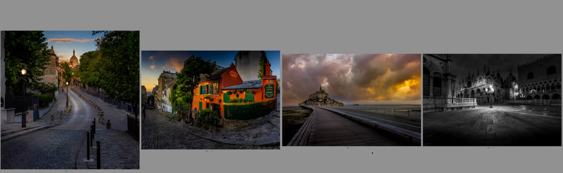
More of the final 23, each one holding up entirely on its own.
Frequently Asked Questions
How many photos should be in a photography portfolio?
There's no fixed number, but fewer, stronger images consistently outperform a large set. In this example, 85 photos were cut down to 23, roughly a quarter of the original set, once the weak and redundant images were removed.
What criteria should I use to choose my best photos?
Judge each photo on light, composition, color, originality, consistency with the rest of your work, and how well it represents your brand as a photographer, not just whether the image looks good on its own.
How do I choose between two similar photos?
Use Lightroom's Survey Mode to view them side by side rather than one at a time. Differences that are invisible when judging photos individually become obvious the moment you compare them directly.
Should black and white and color photos be mixed in a portfolio?
It's worth deciding deliberately rather than letting it happen by accident. Mixing them without a plan can break the visual consistency of the portfolio, so consider separating them into distinct sections or galleries.
Explore More From Photo Serge
Want to keep building your skills? Here are more guides:
- How to Get Rich, Natural Colors in Lightroom (Without Overediting)
- The #1 Lightroom Retouching Mistake: How to Fix Mask Halos and Fringing
- The Best Masking Tool in Lightroom: A Step-by-Step AI Masking Guide
