How to Get Rich, Natural Colors in Lightroom (Without Overediting)
Most people trying to get better colors in Lightroom reach for the Saturation slider first, and end up with a photo that looks loud instead of good. The colors that actually make people stop scrolling aren't the most saturated ones, they're the most correct ones: accurate White Balance, clean separation between sky and foreground, and small, surgical adjustments layered on top. Nothing that reads as "filtered."
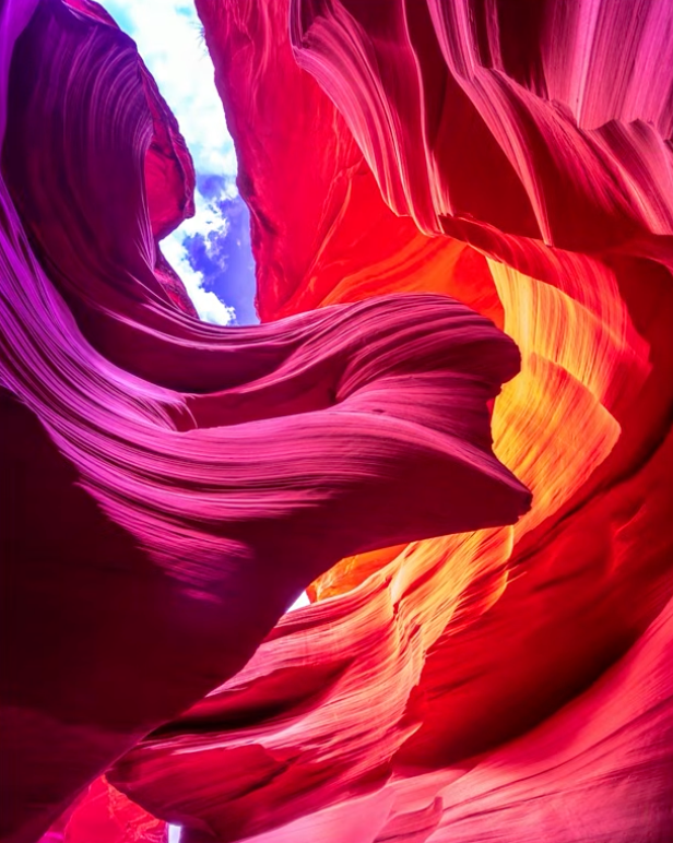
This is what pushing saturation too far looks like: technically colorful, but not believable.
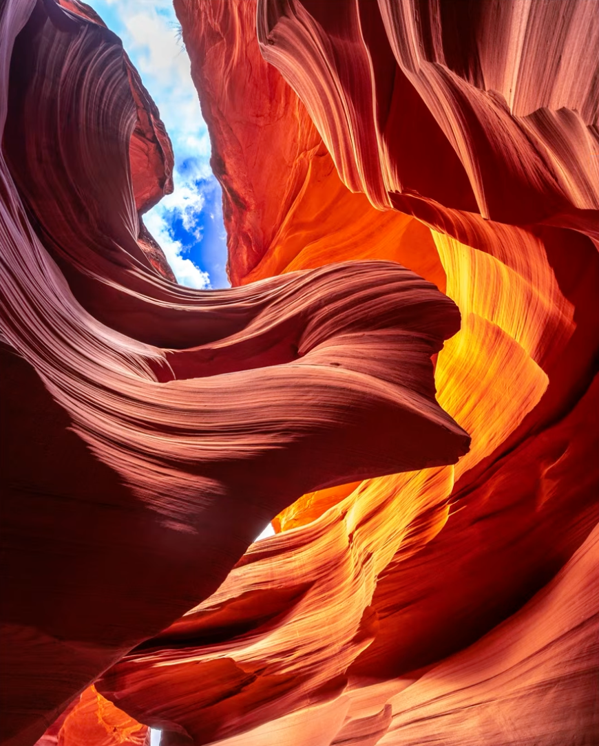
The same canyon, corrected: warm and rich, but still reads as real light.
In this tutorial I'm walking through the exact tools I use to get rich, natural-looking color in Lightroom Classic and Lightroom: White Balance, masking, the Color Mixer, Point Color, and local gradients, then applying all of it to two real, difficult photos: a lavender field in the South of France and a dramatic Antelope Canyon shot.
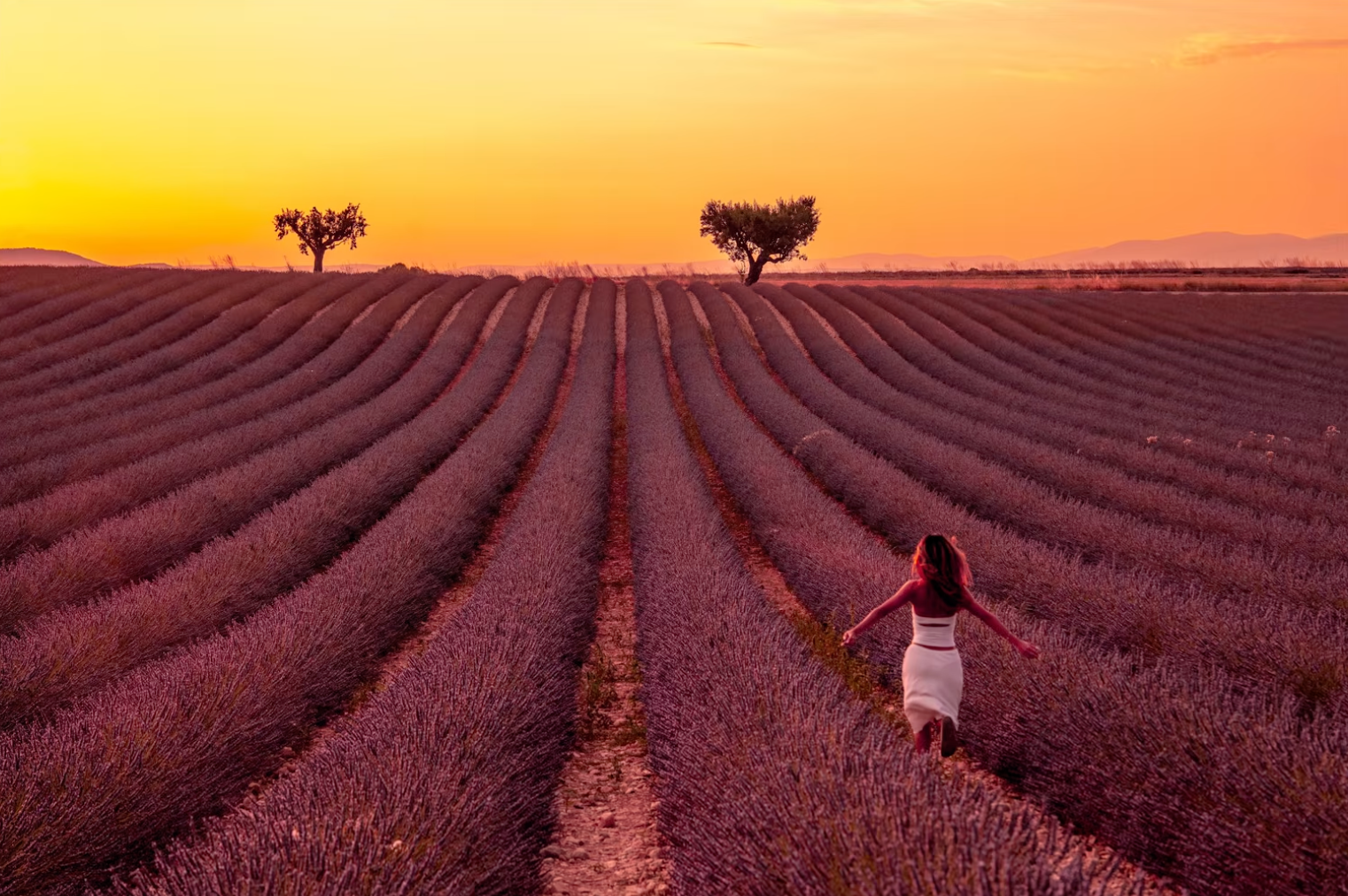
The finished lavender field we'll build toward step by step in this article.
Start With White Balance, Not Saturation
Every color decision you make in Lightroom sits on top of White Balance. If your White Balance is off, warm or cool, every other adjustment you make is compensating for a mistake instead of building on a correct foundation. That's why White Balance is always my first move, before I've touched a single saturation or HSL slider.
The Temperature and Tint sliders are the obvious tools, but the real skill is knowing when White Balance is actually wrong in the first place. A sky that looks slightly too purple, skin that reads a little sickly, or a white wall that leans yellow are all signs the White Balance needs a second look before you do anything else.
Local White Balance: Separating Sky From Foreground
Global White Balance is a compromise. It's one setting trying to satisfy every color in the frame at once, and skies almost never agree with foregrounds about what "correct" should look like. This is where masking changes everything: create a landscape mask, sky, mountains, vegetation, or natural ground, and you can push White Balance independently on each side of that boundary.
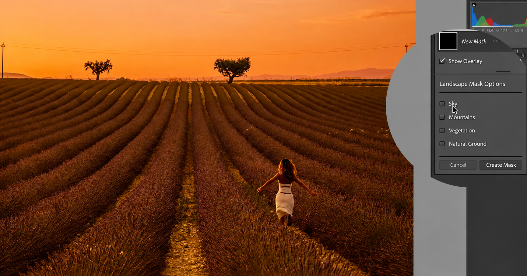
Lightroom's Landscape mask: sky, mountains, vegetation, and ground can each be selected on their own.
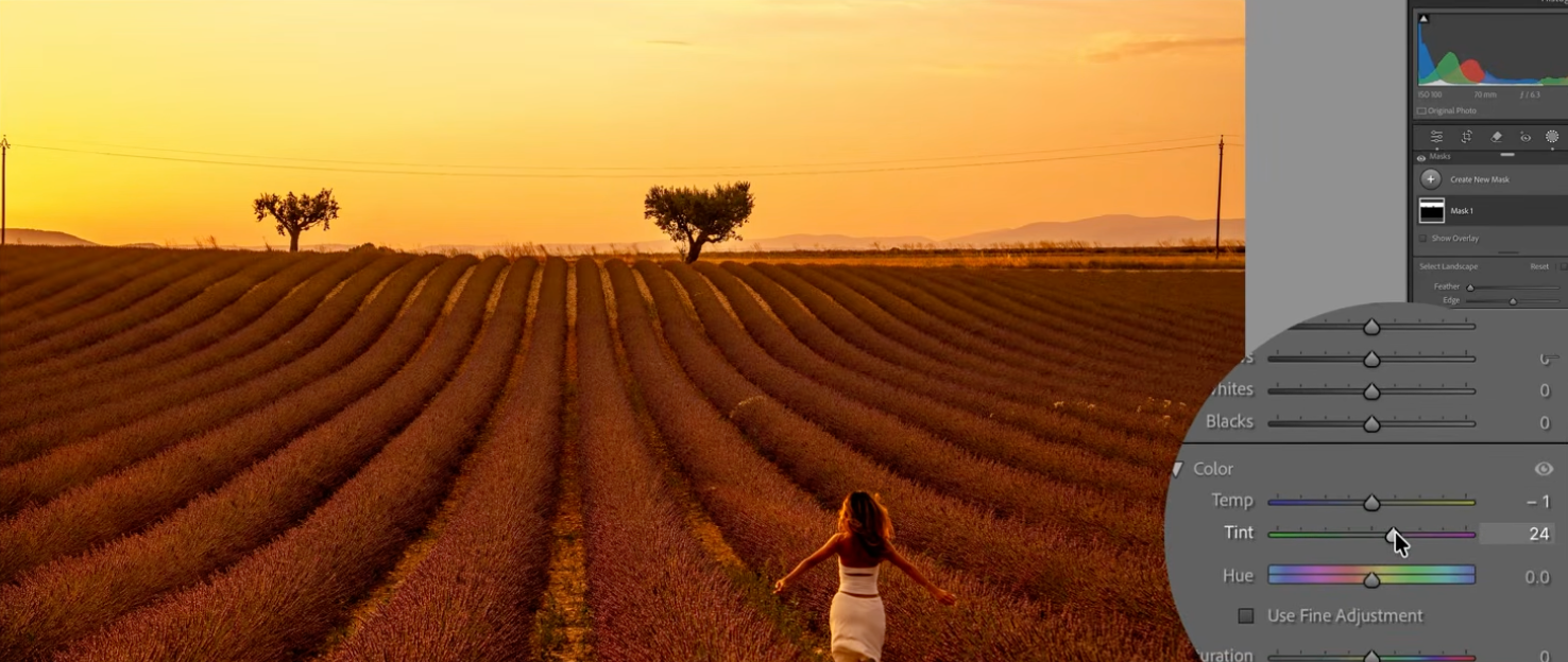
White Balance pushed inside that mask only, warming this one selection without touching the rest of the photo.
Once one side is corrected, the mask menu's Duplicate and Invert Mask option creates a matching mask for everything outside it, so the other side of the frame gets its own independent White Balance instead of inheriting whatever the first mask used.
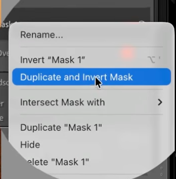
Duplicate and Invert Mask creates a second mask covering everything outside the first one.
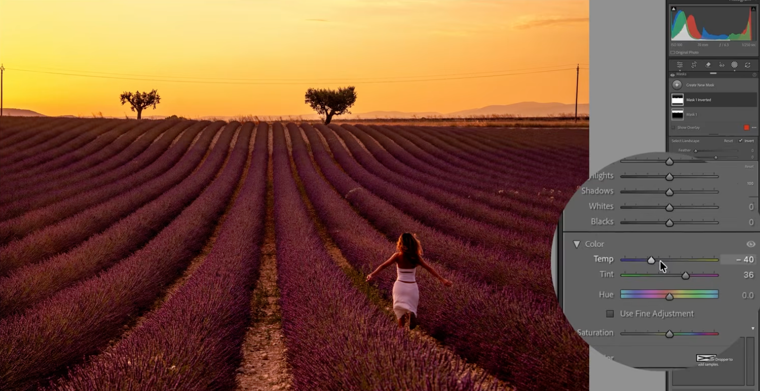
That inverted mask gets its own White Balance, independent from the first selection.
A sky that's fighting your foreground for warmth is one of the most common reasons a photo feels like the colors are "off" without being able to say why. Separating them with a mask, rather than compromising with one global setting, is usually the fix.
The Color Mixer (HSL): Hue, Saturation, and Luminance
Once White Balance is correct, the Color Mixer (HSL) is the next tool, and it's more precise than most people give it credit for. Instead of one global Saturation slider, HSL lets you adjust Hue, Saturation, and Luminance independently for each color band: reds, oranges, yellows, greens, blues, and so on.
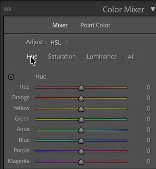
The Color Mixer's HSL tabs: Hue, Saturation, and Luminance, adjusted one color band at a time.
This is where you push warmth into a sunset without blowing out the rest of the image, or pull a green that's reading too yellow back toward true green, all without touching any other color in the frame. Small moves here go a long way.
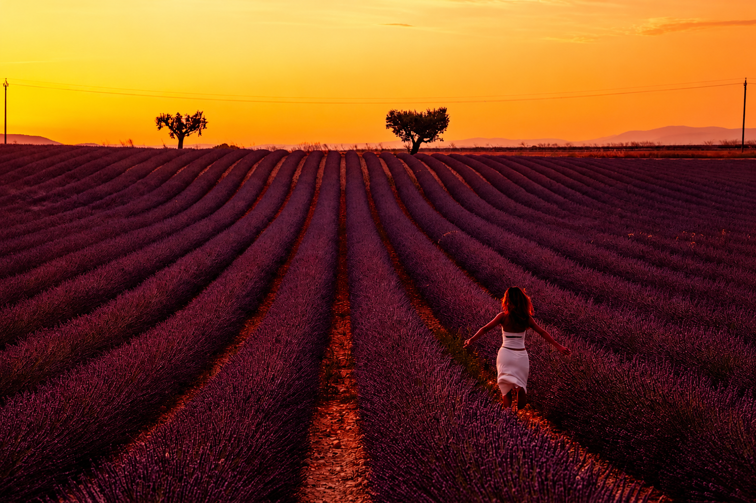
The lavender field before any Color Mixer adjustments.
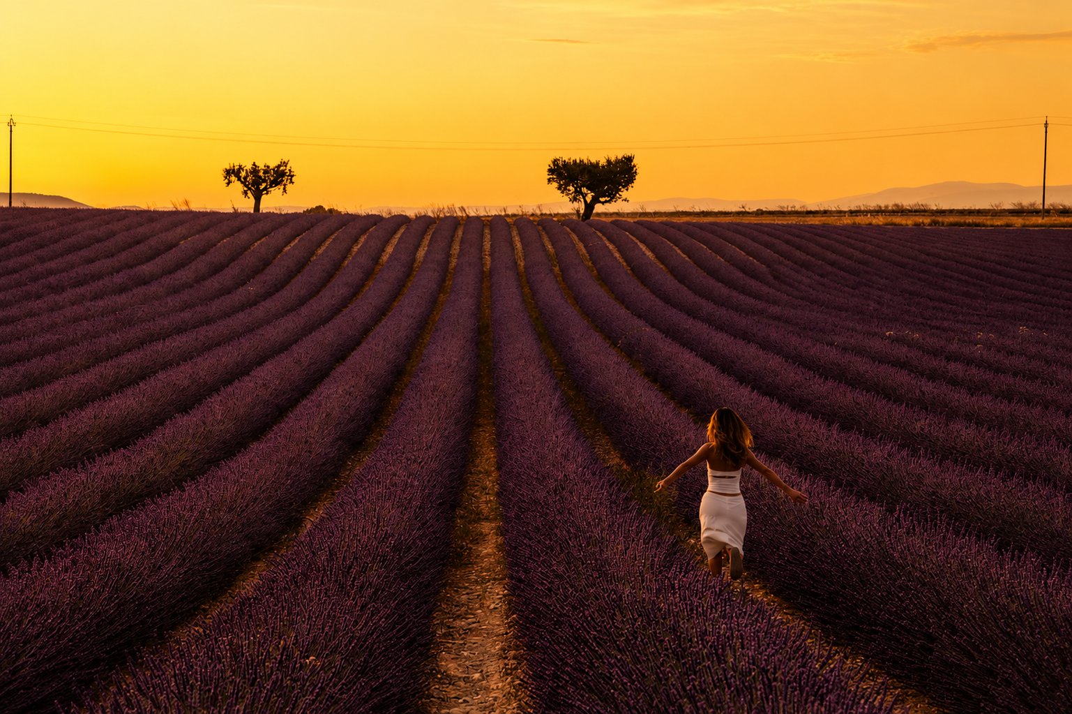
After: a small shift toward a richer, more even purple, nothing else in the frame touched.
Oversaturated, unrealistic color almost always comes from pushing one slider too far rather than making several small, targeted adjustments like these.
Point Color for Surgical Precision
Point Color goes a step further than HSL. Instead of adjusting a whole color band like "orange" or "blue," you click directly on a specific color in the photo and adjust just that shade, its Hue, Saturation, and Luminance, in isolation. It's the tool for the moments when HSL's color bands are too broad, when you need to shift one specific tone without dragging every other similar color along with it.
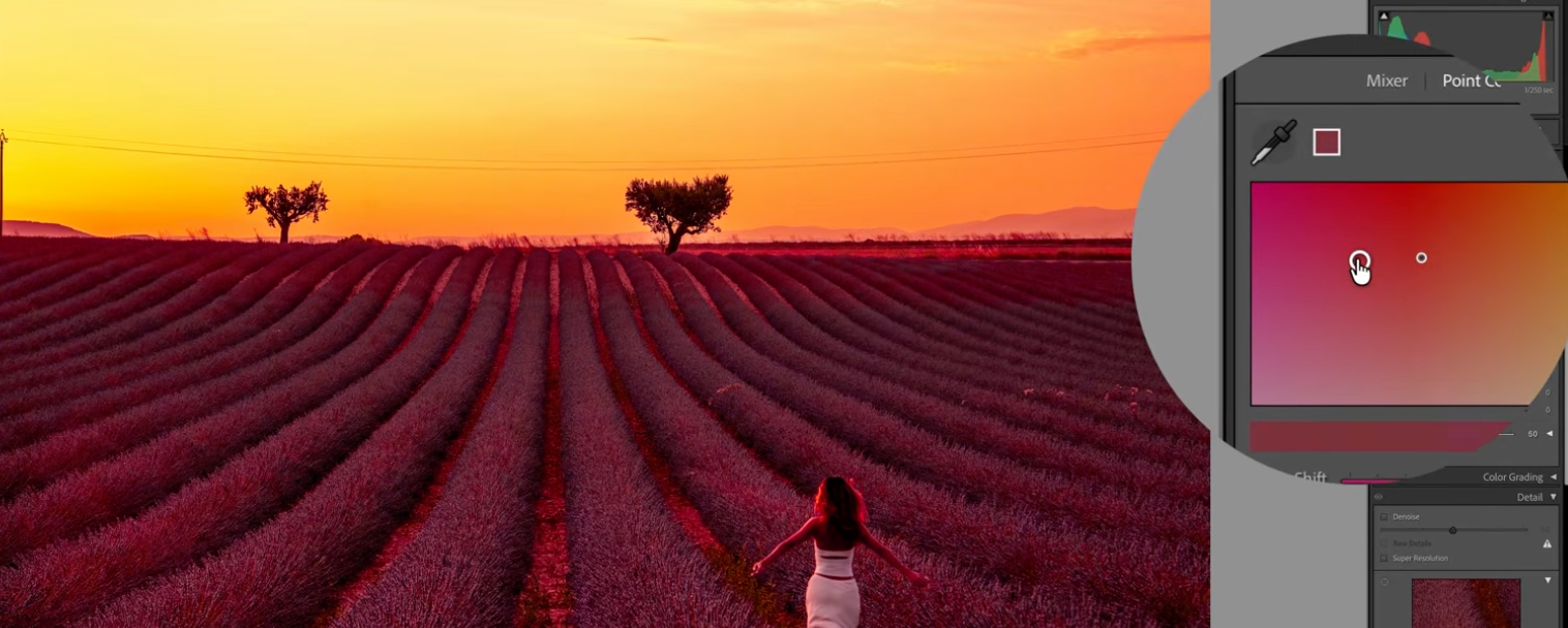
Point Color lets you click directly on a color, here a magenta in the lavender, and adjust just that one tone.
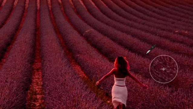
A closer look at the Point Color dropper sampling that exact shade in the rows.
Adding Color Naturally With Gradients and Local Adjustments
Beyond correcting what's already there, local adjustments, radial and linear gradients especially, are how you add color that was barely present in the original file: a touch of blue in the shadows, warm orange low in a sunset, a hint of magenta in a cloud.
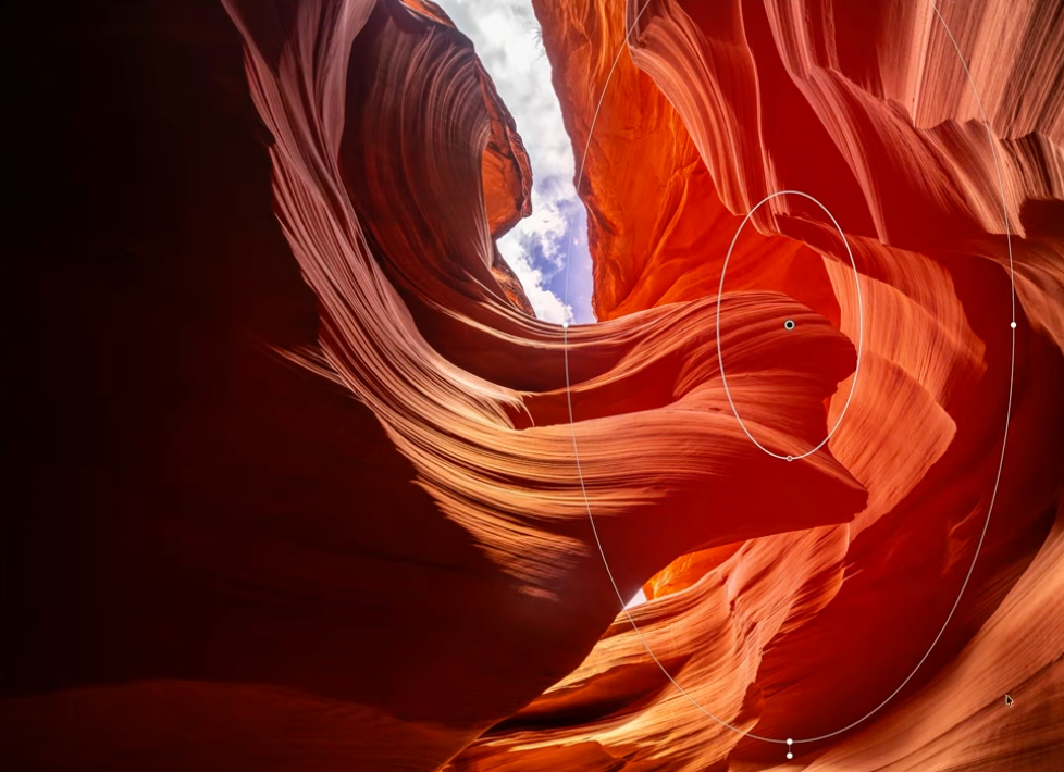
A Radial Gradient added locally to warm up one section of the canyon wall.
The trick is restraint. These additions should read as light, not as paint. If a local color adjustment is noticeable as an edit rather than as part of the scene, it's too strong.
How to Tell When Your White Balance Is Wrong
Beyond the obvious cases, a few reliable tells: if you find yourself fighting the Color Mixer to make skin tones look normal, if a sky and a foreground never seem to agree no matter what you do to either one individually, or if the whole image needs a vague, hard-to-name correction, White Balance is usually the actual problem, and no amount of HSL or Point Color work downstream will fully fix it.
Real Example: A Lavender Field in the South of France
A lavender field is a genuinely difficult color problem: purple flowers, green foliage, and often a warm sky, all fighting for attention in the same frame. Getting this right starts with White Balance across the whole scene, then Color Mixer work to keep the purple rich without letting it slide toward magenta or blue, and separate control over the greens so the foliage doesn't compete with the flowers for saturation.
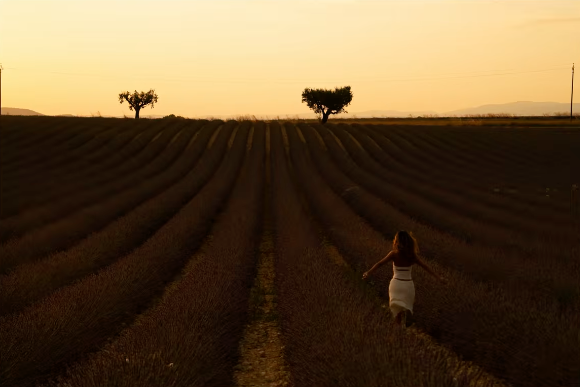
The lavender field before any real color work: flat, the purple barely visible.
This is also the point in the process where a lot of edits go wrong. It's not that people skip retouching, it's that they retouch and still end up with the wrong colors: muted, slightly green-brown lavender instead of the rich purple that's actually there in the light.
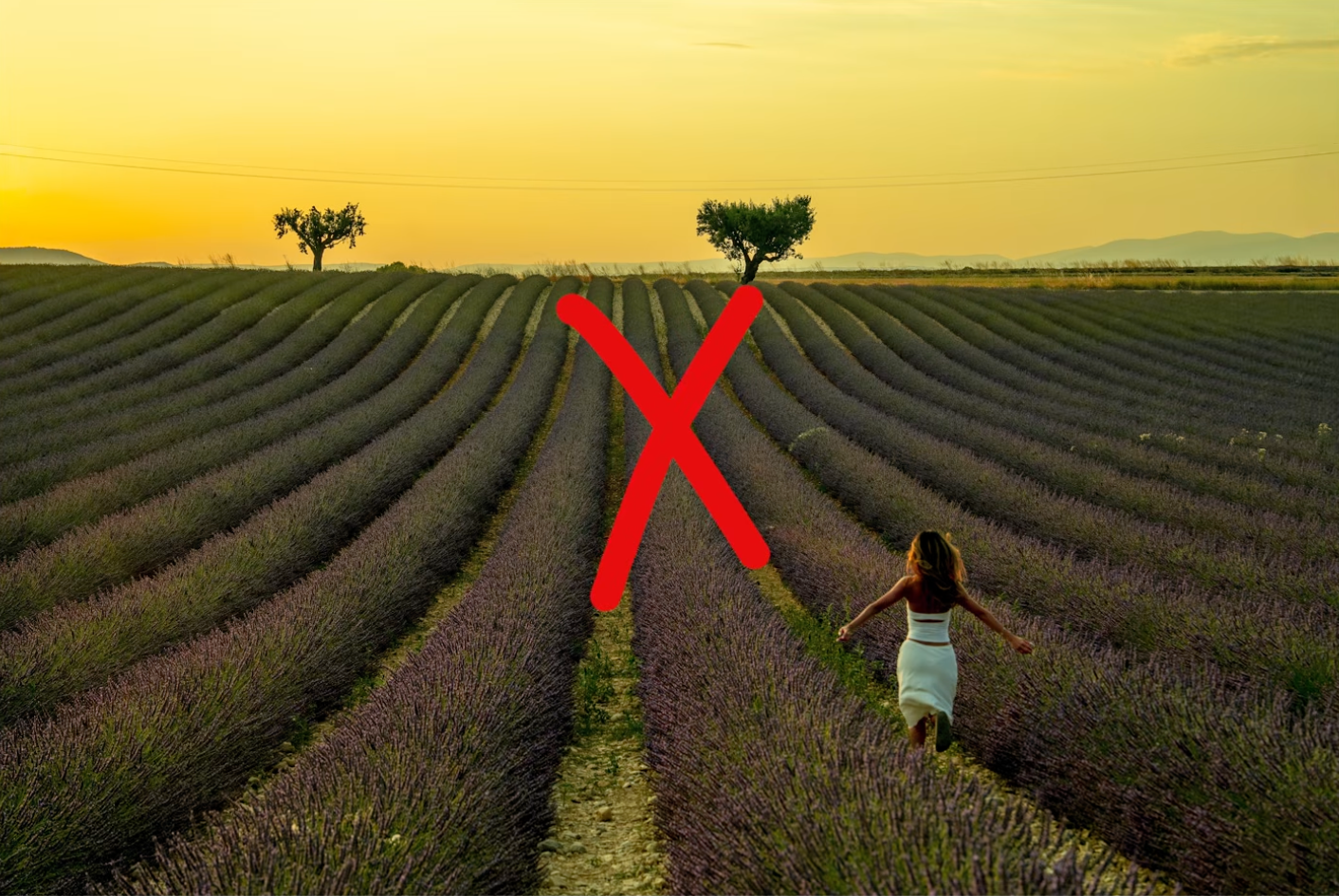
Edited, but still the wrong colors: dull and green-brown instead of the true purple.
The same field with the retouching finished.
Real Example: A Dramatic Antelope Canyon Photograph
Antelope Canyon is the opposite kind of challenge: instead of many competing colors, it's about pulling the full range of warm tones, deep reds, oranges, and golden light bouncing off sandstone, out of a single dominant hue without making the whole image look like one flat color wash. This is where Point Color earns its place: isolating specific tones within that orange-red range and adjusting them individually is the difference between a canyon photo that looks graded and one that just looks orange.
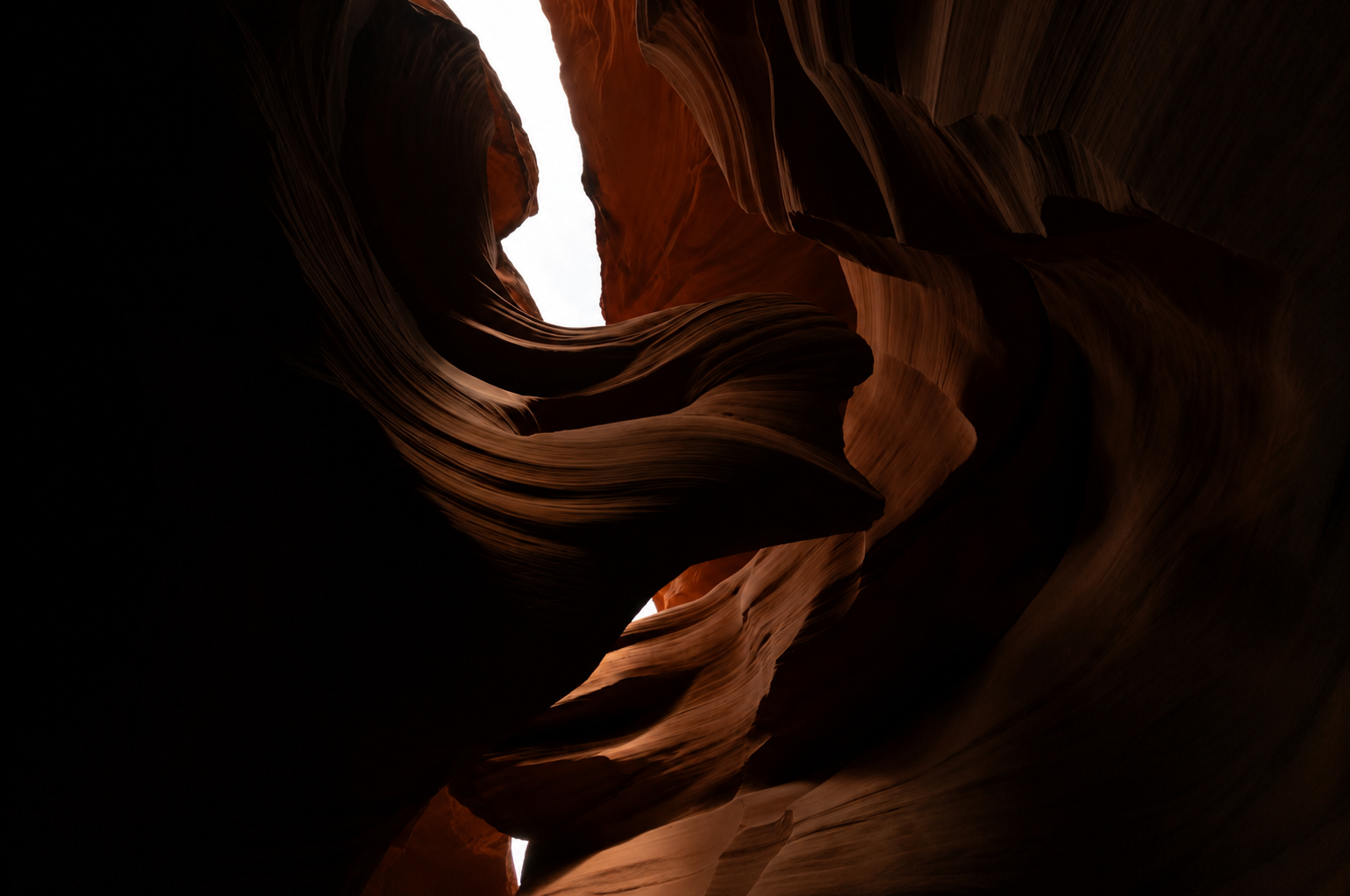
Antelope Canyon straight out of camera: dark and flat, with a blown-out sky at the top of the frame.
The finished canyon: rich warm sandstone tones, without tipping into the oversaturated version shown earlier.
The Goal Is Cinematic, Not Oversaturated
Every tool in this workflow, White Balance, masking, HSL, Point Color, gradients, is in service of one goal: color that makes someone say "wow" without registering as an edit at all. The moment a photo reads as Photoshopped or over-filtered, the color work has gone from an asset to a distraction. Correct first, then enhance in small steps, and check your work against the original scene, not against how dramatic you can make the sliders go.
Frequently Asked Questions
What's the first step to getting better colors in Lightroom?
Correct White Balance before touching Saturation or the Color Mixer. Every other color adjustment is built on top of White Balance, so if it's off, you're compensating for a mistake instead of enhancing a correct base.
What is the Color Mixer (HSL) used for in Lightroom?
It lets you adjust Hue, Saturation, and Luminance independently for each color band in a photo, reds, oranges, blues, greens, and so on, instead of applying one global Saturation slider to the entire image.
What is Point Color and how is it different from the Color Mixer?
Point Color lets you click a specific color directly in the photo and adjust just that shade in isolation. It's more precise than HSL, which adjusts a whole color band at once rather than one exact tone.
How do I know if my White Balance is wrong?
Common signs: skin tones that look slightly sickly, whites that read blue or yellow instead of neutral, or a sky and foreground that never seem to agree in color no matter what you adjust downstream.
Explore More Lightroom Tutorials
Want to keep building your editing skills? Here are more step-by-step guides:
- The Best Masking Tool in Lightroom: A Step-by-Step AI Masking Guide
- 10 Lightroom Secrets That Will Instantly Improve Your Photos
- Lightroom Editing for Beginners: Where to Start
- The #1 Lightroom Retouching Mistake: How to Fix Mask Halos and Fringing
