
8 Photography Mistakes That Are Ruining Your Photos
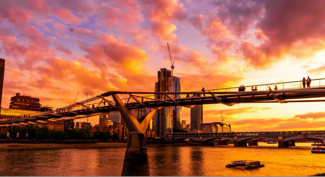
I see the same mistakes over and over in photos sent to me for feedback — small things that quietly ruin an otherwise great shot. None of these need new gear. Here are the 8 I see the most, with real examples from my own catalog, mistakes included.
1. Boring, Empty Compositions
A sunset with nothing to anchor it is just a pretty color, not a photo. If there's no subject, no foreground, nothing for the eye to land on, the shot reads as generic no matter how good the light is.
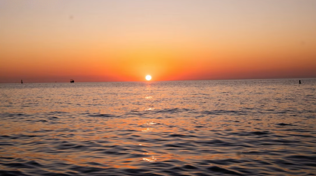
Beautiful color, but there's nothing here for the eye to hold onto — no foreground, no subject, no story.
2. A Distracting or Careless Foreground
Your foreground is doing half the work in a wide shot, so it has to earn its place in the frame. Random litter, footprints or clutter close to the lens pulls attention away from the actual subject — always check the ground in front of you before you commit to a composition.
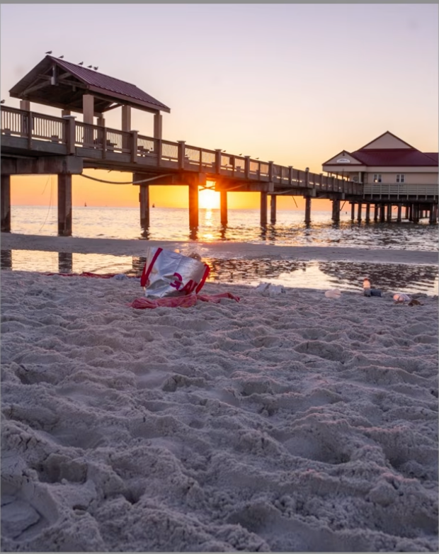
A great pier, a great sky — and a piece of trash sitting right where the eye lands first.
3. Getting White Balance Wrong
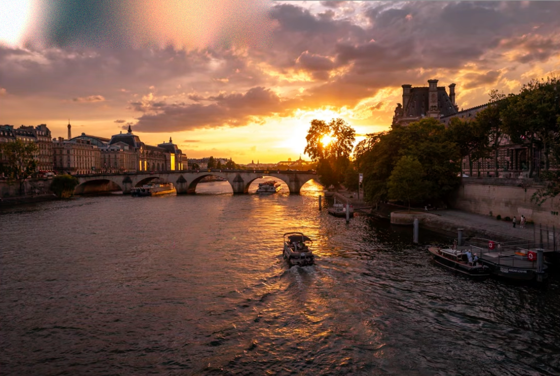
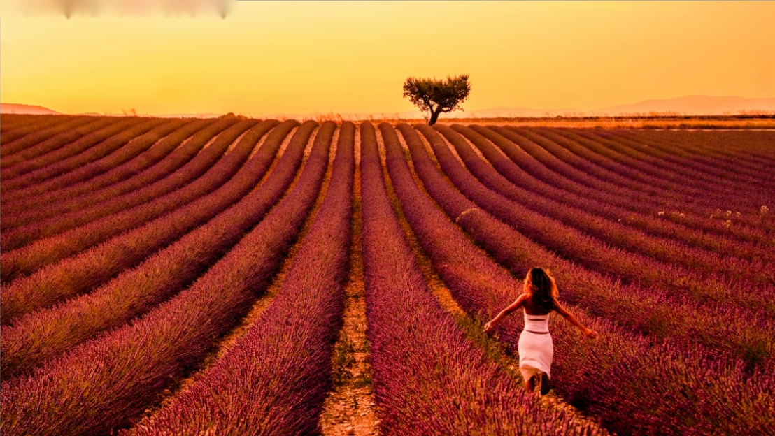
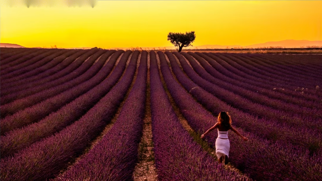
White balance decides whether your sunset reads warm and inviting or flat and lifeless. Too cool and magenta, and you lose the exact warmth that made the light worth photographing in the first place.
Wrong:
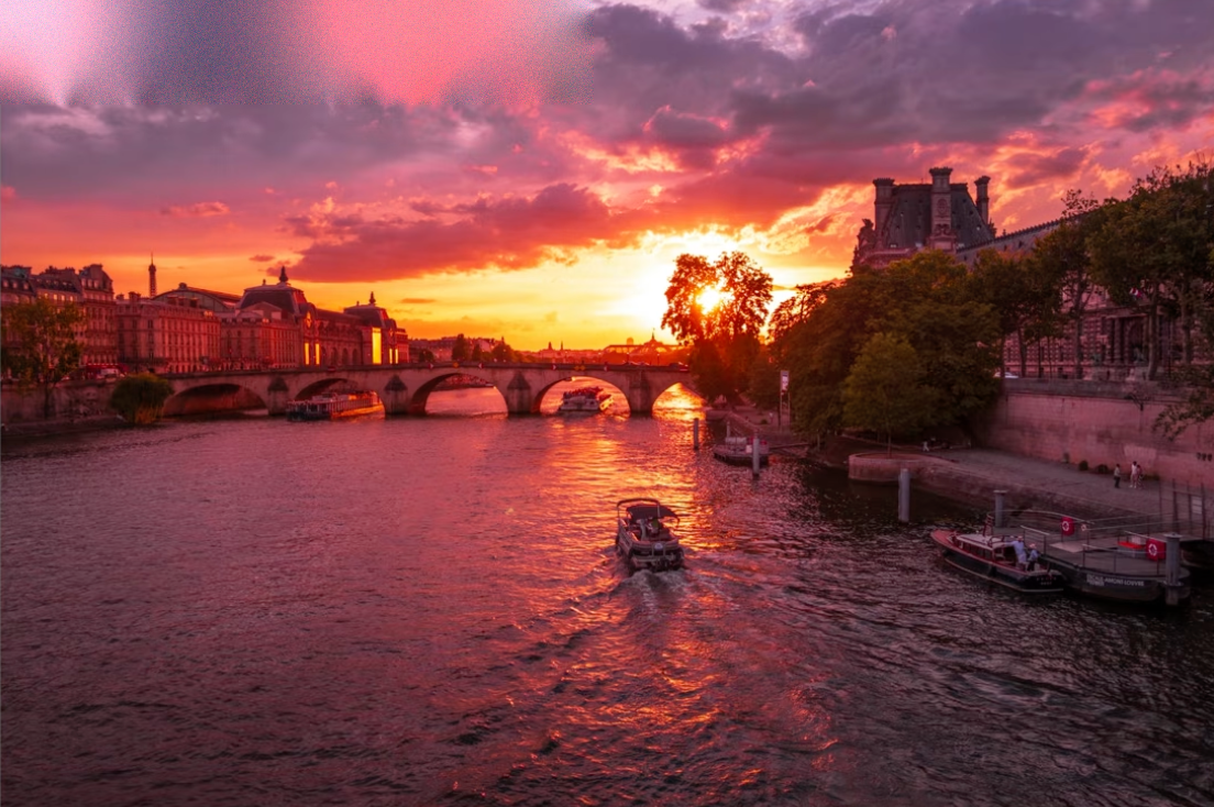
Correct:
Same mistake, different scene — a lavender field at golden hour:
Wrong:
Correct:
4. Over-Editing
It's tempting to push every slider until the photo looks "impressive" on a phone screen — but over-saturating and over-contrasting a photo makes it look fake, not powerful. There's a real middle ground between flat and overcooked, and it's narrower than most people think.
Under-edited — flat, lifeless:
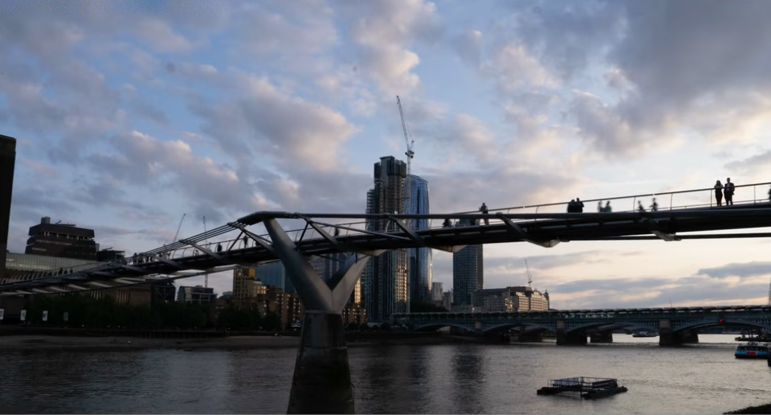
Properly edited — balanced:
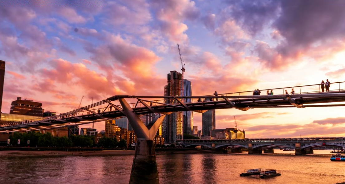
Over-edited — pushed too far:
Same lesson, a Paris sunrise over the Seine:
Balanced:
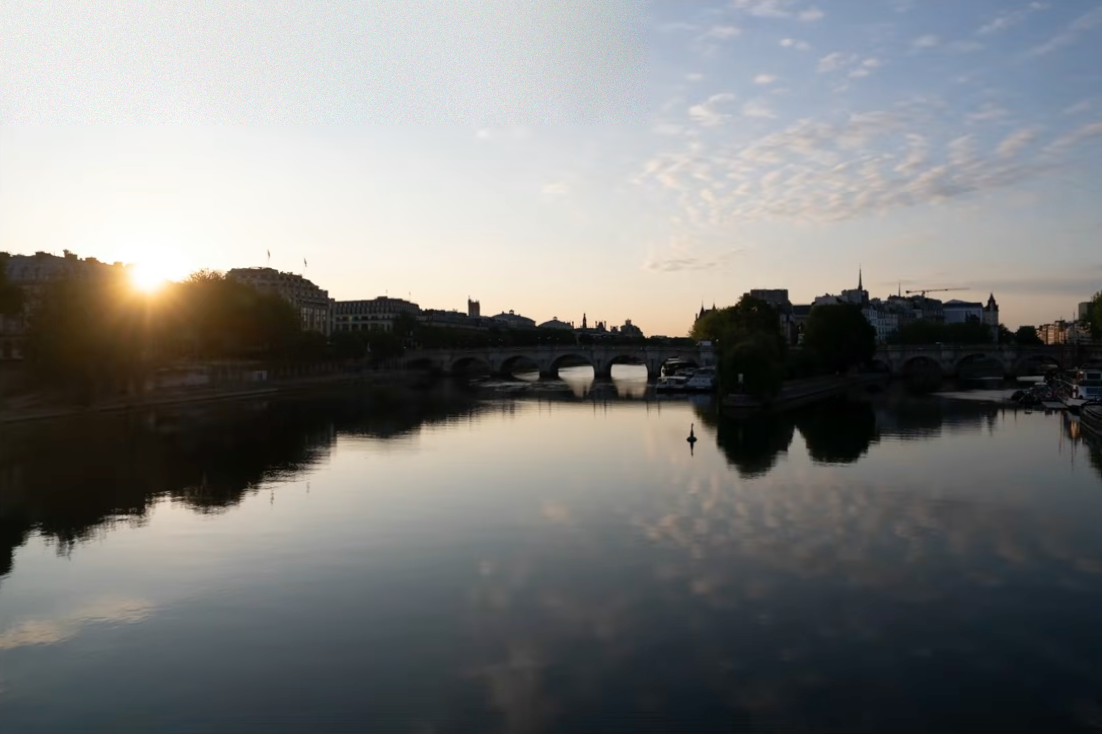
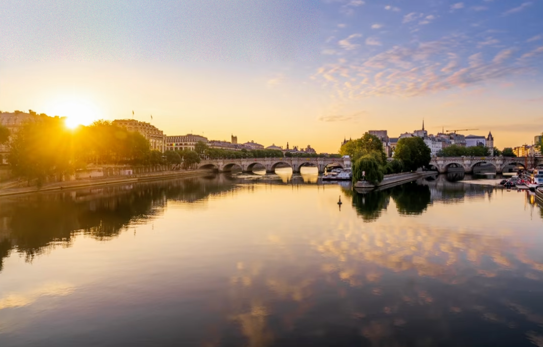
Over-edited:
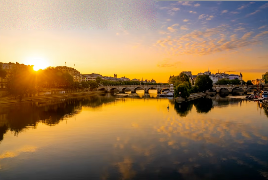
5. Unnatural Halos From Excessive Clarity and Dehaze
Look again at the over-edited Millennium Bridge photo above: notice the bright rim glowing around the dark clouds against the sky. That's a halo — a telltale sign that Clarity, Dehaze or local contrast has been pushed too hard. It's one of the fastest ways to make an otherwise strong edit look amateur, and it's easy to miss on a small screen.
Zoom into the cloud edges — that bright fringe is the halo excessive Clarity/Dehaze leaves behind.
6. Shooting Flat Light Instead of Converting to Black & White
Not every evening gives you color. A flat, overcast sky with no real sunset is a bad color photo — but it can be a great black and white one. When the light is boring, stop fighting it and lean into contrast and tonal range instead.
The problem — flat, boring light in color:
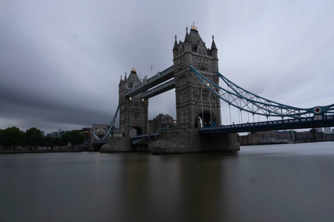
The fix — converted to black and white:
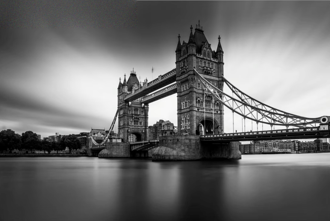
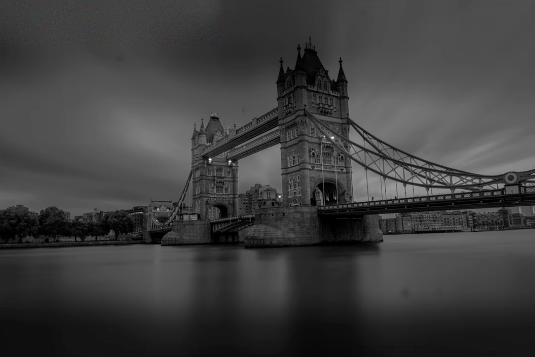
To get the conversion right, I think in terms of the Ansel Adams Zone System — a 0 (pure black) to 10 (pure white) scale for placing your tones deliberately instead of just dragging the black-and-white slider and hoping.
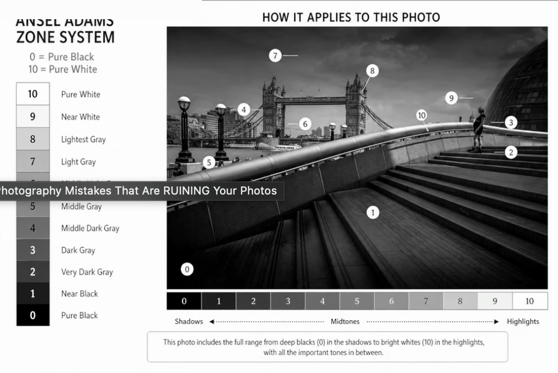
A strong black and white uses the full range from 0 to 10 — not just the middle grays.
7. Bad Horizon Placement
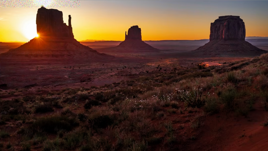
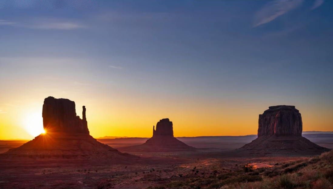
Where you put the horizon changes the entire feel of a photo, so it shouldn't be an accident. This is a version of a rule often attributed to director John Ford: decide whether the sky or the ground is the more interesting part of the frame, then place the horizon deliberately instead of wherever it happened to land. The same Monument Valley sunrise, cropped three ways:
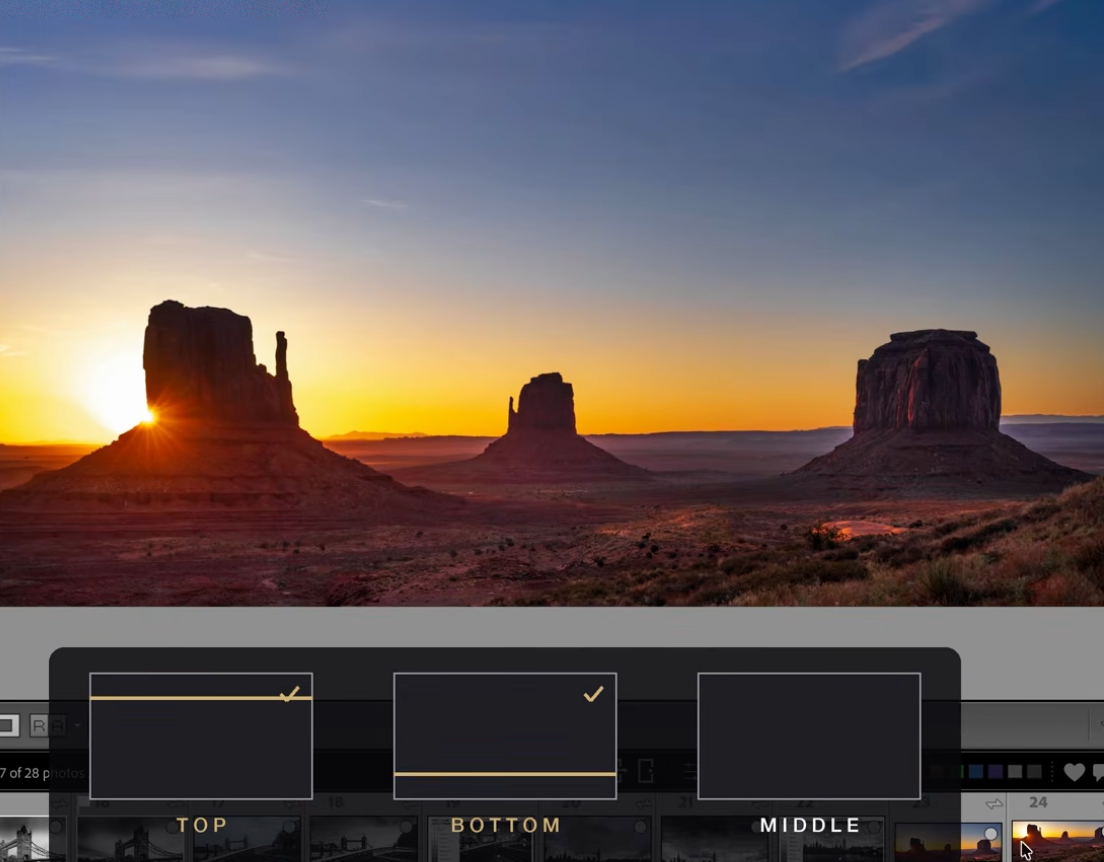
Testing horizon placement directly in Lightroom's crop tool — top, bottom, or middle all read completely differently.
Horizon near the top — the ground and the wildflowers carry the frame:
Horizon near the bottom — the sky and the color carry the frame:
Horizon in the middle — a deliberate choice, not a default:
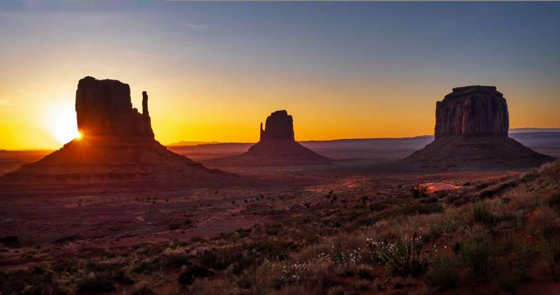
Here the horizon lands close to the middle — and it still works, because the three buttes and the glowing sky are both doing enough to carry equal weight. The point isn't "never center it," it's to compare your options and pick one on purpose, the way these three crops do.
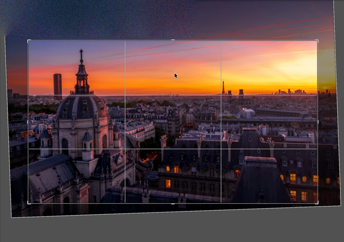
The same thinking applies with a rule-of-thirds grid over a Paris rooftop sunset — letting the grid decide where the skyline and the dome actually sit in the frame:
8. Harsh, Choppy Water Instead of Smooth Motion
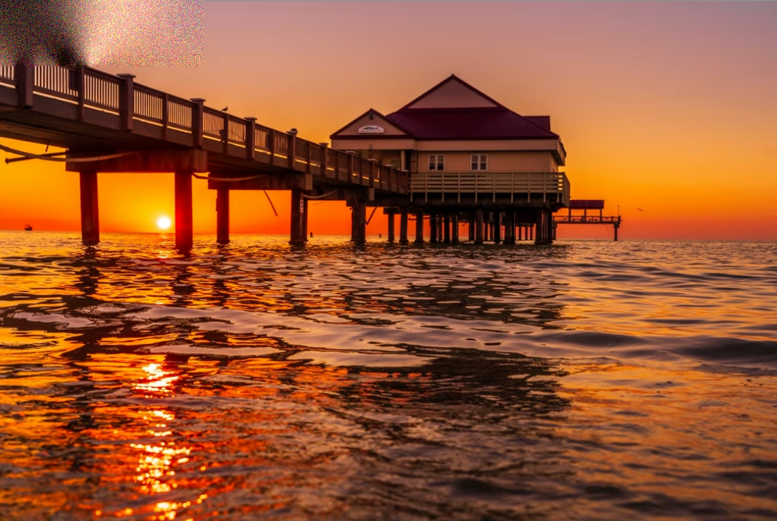
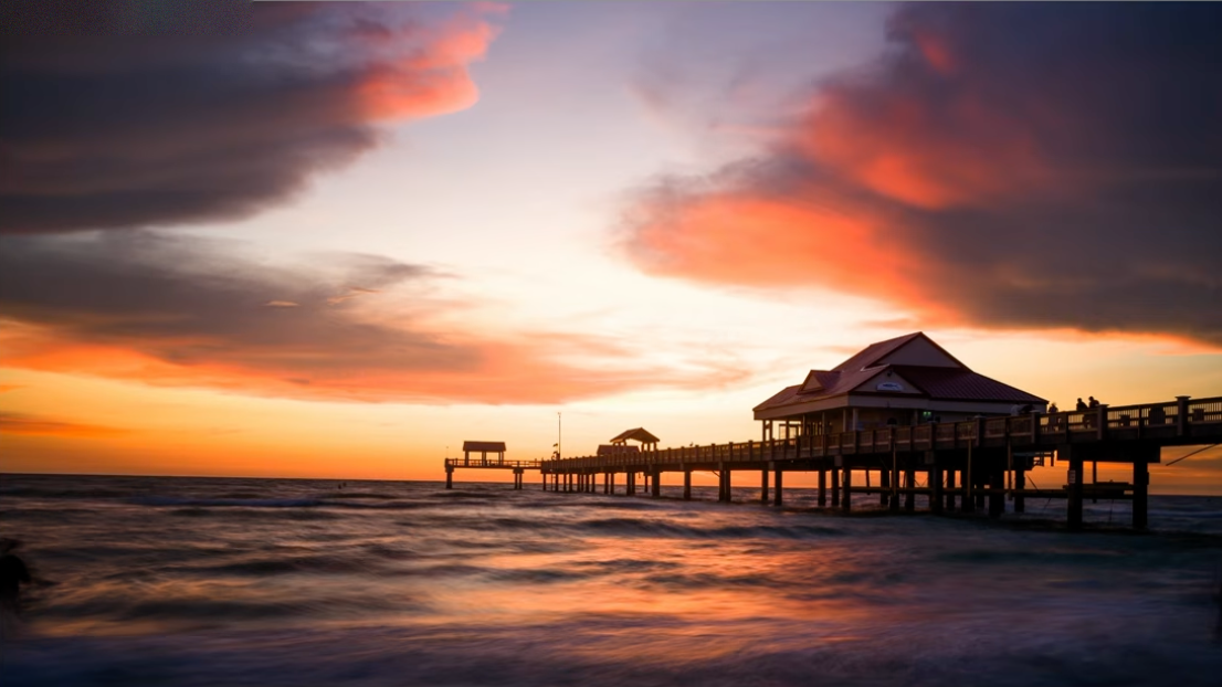
Water can make or break a beach or pier shot. Freeze it at the wrong shutter speed and it turns harsh and distracting — closer to sandpaper than water. Slow the shutter down and the same water turns soft and atmospheric, pulling the eye toward your subject instead of fighting it.
Wrong — harsh, choppy water:
Right — smooth, pleasing water:
Frequently Asked Questions
What's the most common mistake in sunset photography?
An empty composition — beautiful color with nothing for the eye to land on. A sunset needs a subject, a foreground, or a leading line just as much as any other photo.
How do I know if I've over-edited a photo?
Look for halos — a bright rim around dark edges like cloud silhouettes or tree branches. That's the clearest sign Clarity or Dehaze has been pushed too far.
When should I convert a photo to black and white?
When the light is flat and the color isn't contributing anything — an overcast sky with no real sunset color is a weak color photo but can be a strong black and white one.
Where should I place the horizon in a landscape photo?
Wherever you decide on purpose. Decide whether the sky or the foreground is more interesting and give that part more of the frame — or, if both sides are pulling equal weight, a centered horizon can work too. Test it directly in your crop tool if you're not sure.
What shutter speed makes water look smooth instead of harsh?
A slower shutter speed blurs the water's motion into something soft and atmospheric. The exact speed depends on how fast the water is moving, but even half a second can make a big difference over a fast shutter that freezes every ripple.
Explore More From Photo Serge
Want to go further with your editing and composition? Here are more guides:
- 7 Composition Rules Every Beginner Photographer Should Know
- How I Use Ansel Adams' Zone System to Transform Boring Photos Into Stunning Black & White Images
- How to Get Rich, Natural Colors in Lightroom (Without Overediting)
Happy shooting! — Serge
Want more? Explore 10 Lightroom secrets to instantly improve your photos.
Get my FREE Lightroom preset here: https://bit.ly/AIPresets
Serge — Photoserge | Coaching photographers who are serious about getting to the next level.
